Edited Components#
In this section, we will go through the components that have been edited in the volto-bootstrap-theme. For each component, we will explain what has been changed and how the component works in the context of the theme.
Button Block#
What Has Changed?#
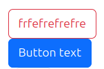
The Button Block component has been updated to fully adopt Bootstrap styles, making it more flexible and customizable. The key modifications include:
Bootstrap Styling: The block now uses Bootstrap’s button styles, which can be modified directly from the edit panel.
New Customization Options: Added options for:
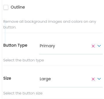
Button Type: Select between different colors for tour button (e.g.,
primary,secondary).Size Control: Choose different button sizes to match design requirements (
sm,md,lg).Button outline variation: Checkbox for the outline variation.
Improved UI/UX: The editing experience now allows users to easily configure the button’s appearance without manual CSS adjustments.
How It Works#
The Button Block allows users to create fully customizable buttons in the Volto CMS. It leverages Bootstrap’s button classes to control its appearance.
When editing, users can:
Select the button type, which will change the button colors.
Checkbox for the outline variation, by default the button will be solid.
Adjust the button size to fit different layouts.
The block is fully responsive, ensuring the button adapts to various screen sizes while maintaining Bootstrap’s consistent styling.
Accordion Block#
What Has Changed?#
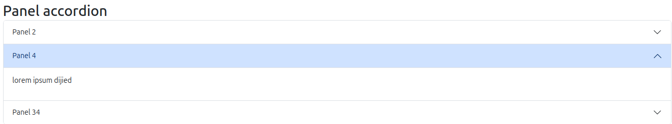
The Accordion Block has been updated to adopt Bootstrap styles, improving its appearance and animations. The key modifications include:
Bootstrap Styling: The block now follows Bootstrap’s Accordion styles for a consistent look and feel.
Smooth Animations: Added Bootstrap’s built-in animation effects for better user experience.
How It Works#
The Accordion Block functions the same way as the default Volto accordion block. Users can add collapsible panels to their pages, toggling sections open or closed as needed.
With this update, the accordion now seamlessly integrates Bootstrap’s responsive behavior and animation, ensuring a smoother and more visually appealing interaction.
Slider Block#

What Has Changed?#
The Slider Block has been updated to incorporate Bootstrap styles and animations, enhancing its visual appeal and usability. The key modifications include:
Bootstrap Styling: The block now follows Bootstrap’s Carousel styles for a more polished design.
Smooth Animations: Integrated Bootstrap’s JavaScript-based carousel animations for a fluid transition effect.
How It Works#
The Slider Block continues to function as before, allowing users to create image sliders within their pages.
With this update, the block now leverages Bootstrap’s responsive behavior and animations, ensuring smooth transitions and an improved user experience across all devices.
Tabs Block#
What Has Changed?#
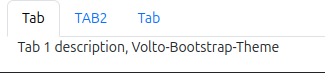
The Tabs Block has been updated to integrate Bootstrap styles and simplify its functionality. The key modifications include:
Bootstrap Styling: The block now uses Bootstrap’s tab components for a more consistent and responsive design.
Removal of Variants: The Accordion and Slider variations have been removed, as dedicated blocks now handle those functionalities. The Tabs Block will always use the default tab layout.
How It Works#
Users no longer need to select a variation, as the Tabs Block now has a single default layout. Other configuration options, such as adding, reordering, and customizing tab labels, remain unchanged.
Column And Grid Blocks#

What Has Changed?#
The Column and Grid Blocks have been updated to adopt Bootstrap’s grid system, ensuring better alignment and responsiveness. The key modification includes:
Bootstrap Integration: The internal class structure has been updated to use Bootstrap’s grid classes while maintaining the same configuration options.
How It Works#
The way users configure these blocks remains unchanged. You can still define column layouts, adjust spacing, and organize content as before—now with Bootstrap’s responsive grid handling the structure automatically.
Conclusion#
These are the blocks that have been updated so far. More changes and improvements will be coming soon to enhance the functionality and user experience. Stay tuned for future updates!